|
Getting your Trinity Audio player ready...
|
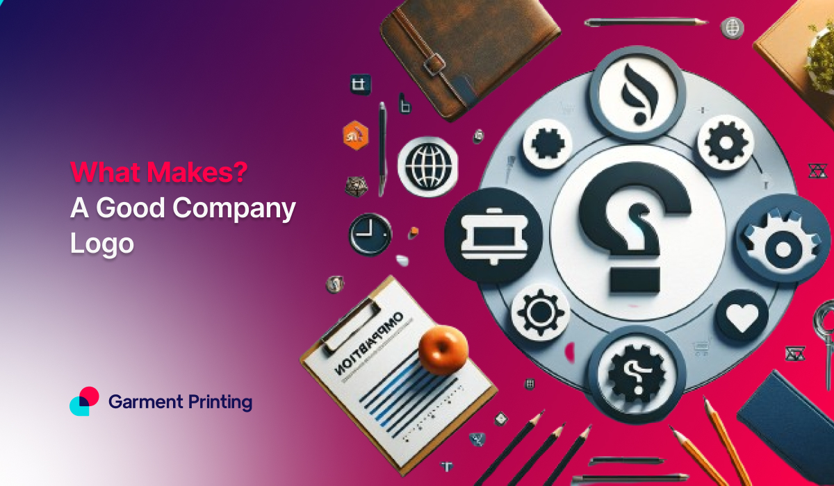
When it comes to crafting your brand’s visual identity, your logo speaks volumes. Designing a logo that endures the passage of time is no simple task, but we are here to make it seamless for you. To ensure your logo resonates, jump into your market, understand your audience personas, and embody your company’s ethos.
Let’s create a logo that leaves a lasting impression.
What is a Logo?
A logo is a visual emblem that represents a business or organization. It’s more than just an image; it’s a powerful symbol crafted with distinct colours, shapes, and typography to embody a brand’s essence and value.
It helps distinguish a company from its competitors and helps shape its image in the minds of consumers. Essentially, a logo is the face of a brand, conveying its personality and values through visual elements.
How to Design a Logo?
Points to be noted:
- Get to know your brand inside out.
- Brainstorm words and concepts that define your brand.
- Sketch out initial ideas inspired by these concepts.
- Test your best sketches against your target audience.
- Refine the selected design for clarity and impact.
- Select adaptable colour schemes.
- Choose a suitable font that complements your brand.
- Ensure the logo remains visually effective at any size.
Here’s a detailed guide to designing the perfect logo:
Step 1: Create a Story of Your Brand
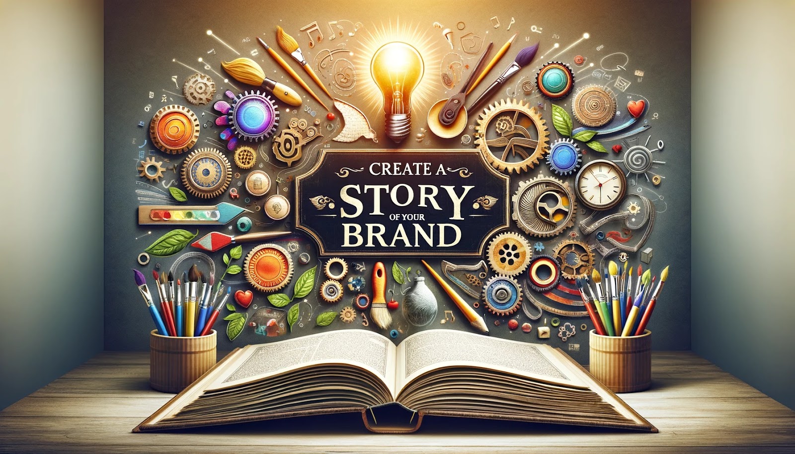
Before raising even a pen or clicking a mouse, be inserted in the plot of your brand, its values, and the emotional impact that it wants to transmit. Understand what makes them different in the market and how they like to be considered by their consumers.
In laying the groundwork for an authentic logo, you must establish the foundation for your brand identity.
Step 2: Brainstorm Brilliance

Explore synonyms and descriptors that are going to capture the essence of your brand and make it a cue guiding you in this design journey. Consider the emotions, values, and characteristics that the logo must carry.
Ensure the keywords to be brainstormed by you are creative with the idea and the logo is in line with the essence of your brand.
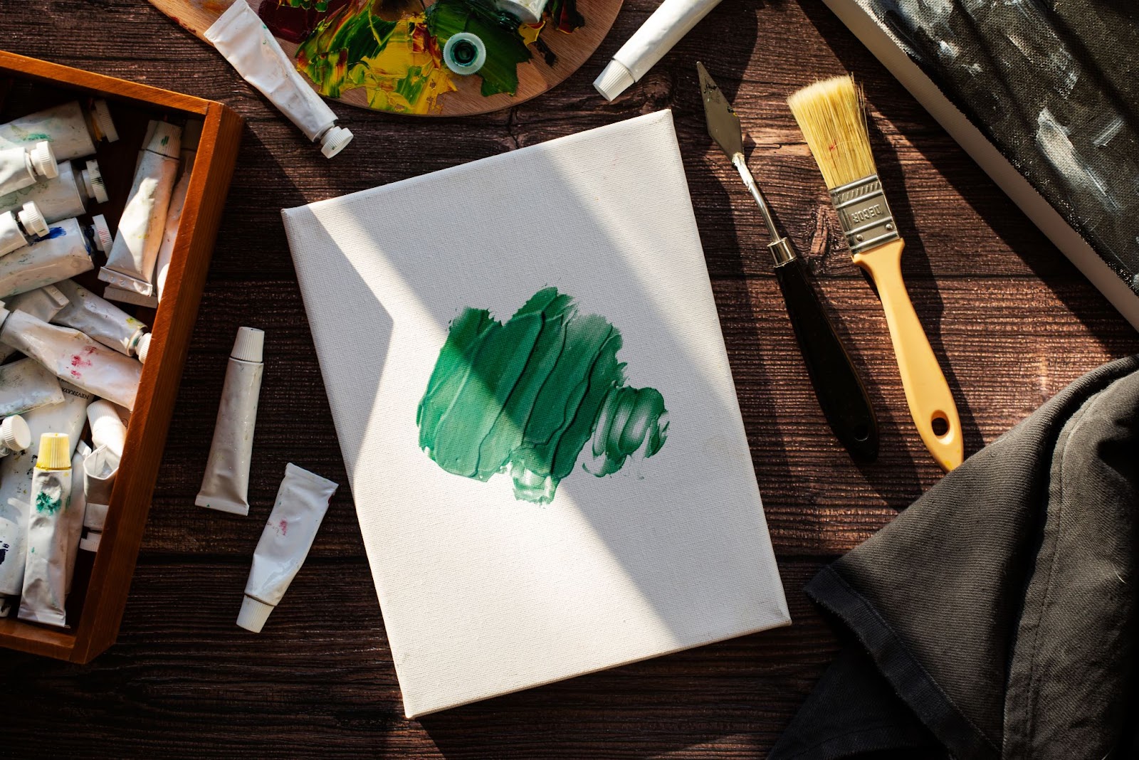
Step 3: Sketch with Gusto
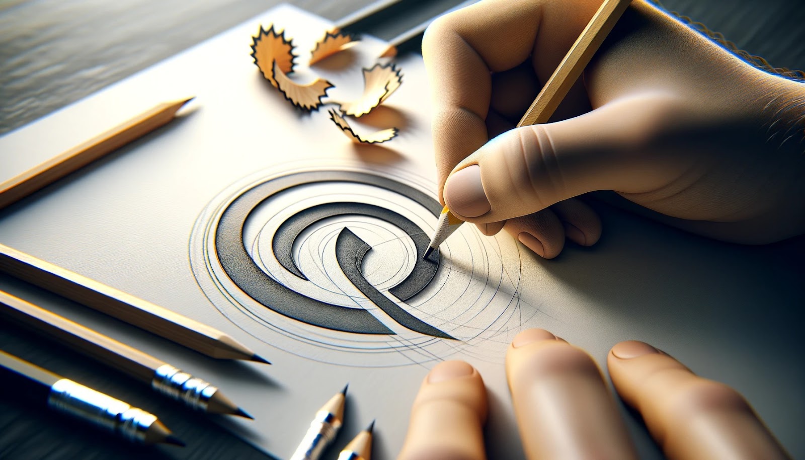
Start with the very first ideas for logos, and let the process be creative, flowing like water with its imperfections. Sketching will help you come up with ideas and let you quickly detect various visual representations of your brand.
Do not be over-conscious in making everything perfect at this point. The main thing is to generate ideas fast.
Step 4: Refine with Purpose
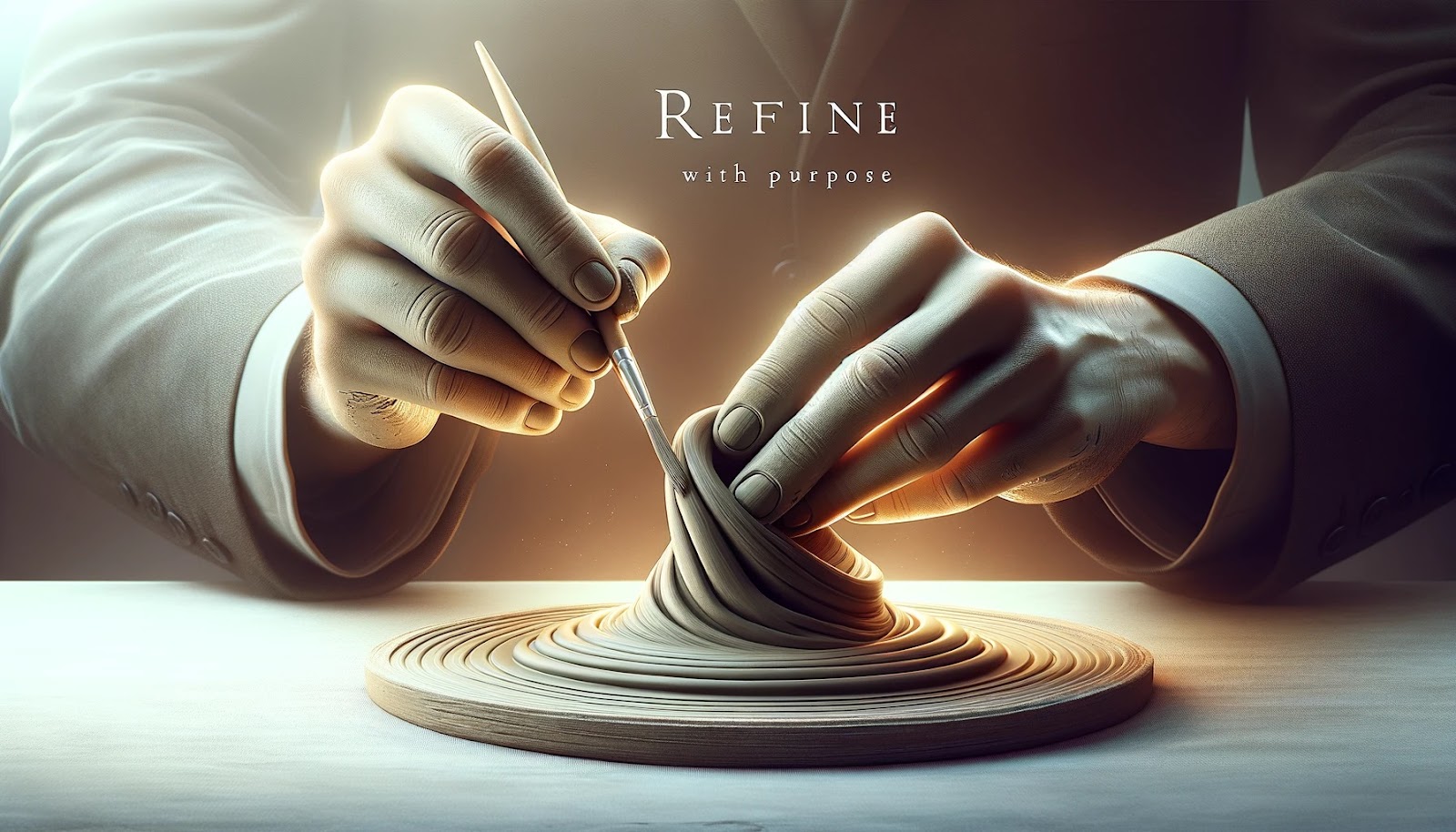
Choose the most promising from the sketches and develop, adding details where necessary but ensuring that the brand identity and core values are preserved. Take the chosen concept, detail in terms of line thickness, and symmetry proportion, and put more emphasis on it.
Thereafter, this stage of the process is all about refining your design to create a strong brand message.
Step 5: Digital Development
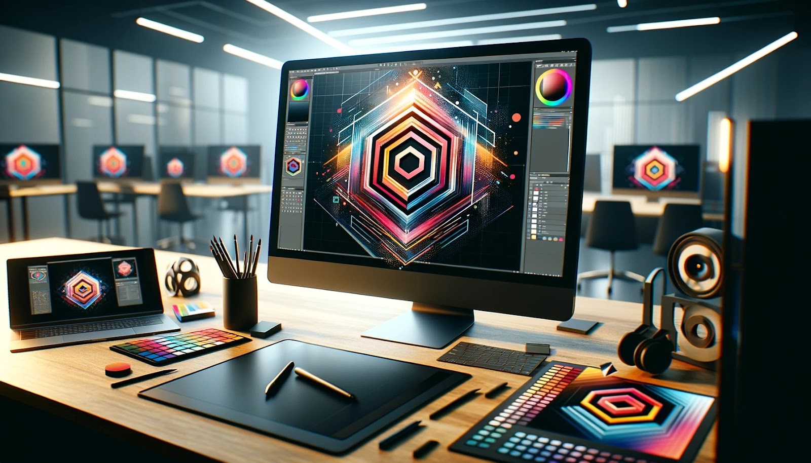
Then, move this concept into digital design while playing with layout and composition. Redo your sketch in the design software with this idea but convert it to a digital format to experiment with laying out more details.
It allows you more flexibility and precision in shaping your design.
Step 6: Colour Your Canvas
Choose a colour palette that would best relate to the brand values and also appeal to the identified target audience. Do check that your brand identity complies with the meaning and symbolism of the different colours it involves.
Make sure your colour schemes relate to the correlation between brand values and the target audience.
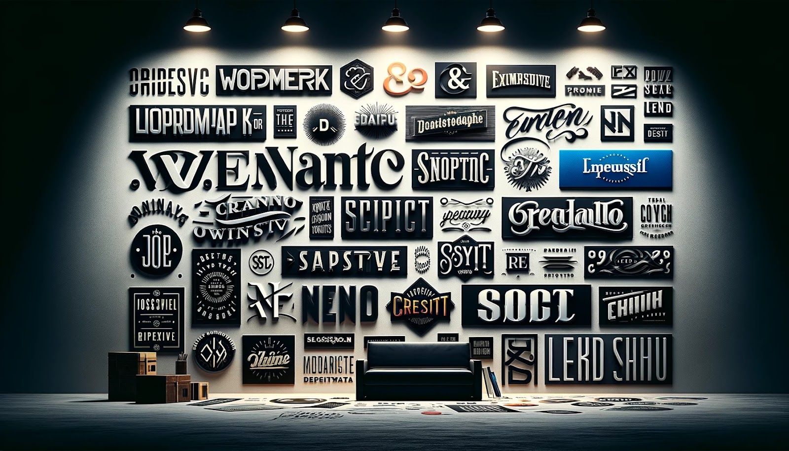
Step-7: Typeface Matters

Opt for a font that perfectly fits your brand identity and is clear and legible on any platform. Choose the right font that fits by catering to the tone and personality of the brand.
Ensure that it is readable, styled for versatility, and has an impact but be careful not to narrow, stretch, or add any other disproportion to the logo.
Step-8: Ensure Structure

Your logo should be legible and recognizable whether blown up on a billboard or reduced on a business card. Test your logo in various media and at different sizes for both legibility and recognition.
A good, versatile logo will hold its punch through a variety of applications and, with that very versatility, multiply your brand exposure and remembrance.
Step-9: Seek Insight

So, feel free to approach for feedback to peers and stakeholders to how best your design shall be improved through constructive criticism. You will, therefore, have heaps of feedback from well-trusted colleagues, clients, and most importantly from focus groups to help make your logo design vibrant, serving its purpose with your market audience.
Use their feedback to improve your logo, ensuring it resonates with your target market.
What are the Types of Logos?
There are several types of logos commonly used by businesses to represent their brand identity:
Wordmark or Logotype
Examples include Coca-Cola, Google, and FedEx, which all consist of the company name or the brand initials in a stylised font or custom typography.
Lettermark

Features the initials or acronym of the company uniquely and recognisably. Examples include IBM, CNN, and HBO.
Emblem
It consists of the wordmark together with either a symbol or an icon, very often enclosed within a shape or badge. Such examples include Starbucks, Harley-Davidson, and BMW.
Pictorial Mark or Symbol

Uses a unique graphic or symbol that represents the brand without any text. For example, Apple, Nike, and Twitter.
Abstract Mark

Employs an abstract design or geometric shape to convey the brand identity. Examples include Pepsi, Adidas, and Airbnb.
Mascot

It characterizes the brand with a brand character or mascot used to personify the personality and values of the brand. For example, Colonel Sanders for KFC, Bibendum for Michelin, Mickey Mouse for Disney.
Combination Mark
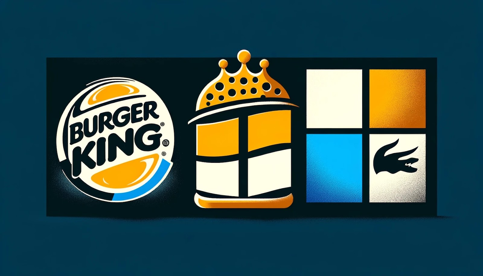
A combination logo brings together a wordmark or lettermark with a symbol or icon to create an integrated brand logo. Companies using this type of logo include Burger King, Microsoft, and Lacoste.
Logo Design Best Practices

Opt for Simplicity
Simple and uncluttered, it must convey the message of your brand instantly, unmistakably by your logo. The idea is to make a logo that is easily recognisable and comprehensible for your target audience.
He draws inspiration from the swoosh logo of Nike—a simplicity classic because it’s remained timeless and unchanged since 1995.
Ensure Versatility
Your logo must be flexible and effective on various backgrounds and colour palettes. Run test designs through various settings and mediums to prove legible and visually affecting at all times.
It’s imperative to have alternative colour palettes and logo orientations to accommodate any situation seamlessly.
Design with Your Audience in Mind
Tailor the design to the essence of the brand and the perceptions the audience would have. Research details like demographics and preferences of your audience, then design something they would expect and be interested in.
If you understand the buyer’s persona of your audience, then forming the logo in a way that will help you communicate your brand message is cardinal.
Cultivate Originality
Be different among so many, not avoiding clichéd design ideas and symbols that have been used already a million times. Come up with the original concept that will put your brand over the competitors.
For instance, avoid logo designs in the shape of the globe—it would only be the same old and very common. An original logo design will breed memorability and allow your brand identity to be something very unique in the eyes of the consumers.
Pursue Timelessness
Try to develop a timeless logo, something that would eventually become a trendsetting piece. It should be equally relevant in another century as it is across time within generations. While achieving the iconic status of brands like Coca-Cola is a rare aspiration ground, aim for a timeless design that achieves longevity with enduring appeal.
So don’t fall into that trap of the latest new design trend this week. Instead, go for something more timeless. A timeless logo does feel like it’s been there for years and will continue to represent your brand faithfully years from now.
Balance
A well-distributed logo would be one in which its elements are too much on one side more than the other, giving it some visual imbalance.
Balance is a great factor in giving a sense of polished and visual allure in a logo. Just like balance, visual symmetry is employed in spacing and alignment.
Repetition
Contrary to what may be common belief, repetition does not make the logo monotonous. Instead, this action helps bring the viewer’s eye from one end to the other very naturally, in the process by which the information gets easily absorbed.
Even with subtle changes, including aspects of colour or the shape of the logo, the patterns add extra interest to the eyes without losing coherence.
Contrast
Properly set contrast will add a powerful visual impact to your logo design. Both the elements, when placed in opposition to each other—such as colors, shapes, or textures—can give the logo dynamic visual tension and hence, grab the attention of the viewer.
Contrast can give your logo a three-dimensional quality and depth, whether through its different colours or design elements.
Dominance
For example, the dominance in establishment means that some highlights within the logo take centre stage to act as a point of focus. Whereas there is balance needed, some highlighted features will add vitality and dynamism to the design.
Some elements can be raised visually, leading the eye of the viewer and they do exist to make lasting impressions.
Hierarchy
The visual hierarchy is just another integral part that ensures important information within your logo is communicated effectively. Structural elements guide eye movement by being arranged in a logical sequence to aid in the processing of information.
Whether this is achieved through typography, framing, or colour usage, a clear hierarchy raises your logo above the bar in terms of clarity and coherence.
Tips for Designing a Logo
- Opt for an analogous or complementary colour scheme that harmonizes with your brand’s identity.
- Prioritise readability by selecting clear typography.
- Utilise white space strategically to enhance the impact of your logo.
- Ensure all elements are aligned cohesively for a polished appearance.
- Embrace simplicity in design over unnecessary complexity.
- Establish a logical visual flow to guide the viewer’s attention.
- Incorporate symmetry to achieve visual balance and harmony.
- Introduce shapes and lines to create dynamic contrast within your logo.
- Enhance memorability by integrating impactful icons.
- Surprise and engage your audience with unexpected design elements.
- Infuse your logo with your brand’s identity and values.
- Get the preferences and values of your target audience.
- Streamline your design by removing any extraneous elements.
- Design your logo as a vector file to ensure scalability and adaptability.
- Maintain colour consistency by utilising Pantone colours.
- Communicate your message through your logo design.
- Aim to leave a lasting impression with your logo’s visual impact.
Conclusion
Designing a good company logo is a multifaceted process that requires careful consideration of various elements, from understanding your brand identity to incorporating design principles effectively.
By immersing yourself in your brand’s story and values, brainstorming creative concepts, and refining your designs with purpose, you can create a logo that resonates with your target audience and effectively communicates your brand message.
Remember, a successful logo is one that not only leaves a lasting impression but also captures the essence of your brand and resonates with your audience for years to come.
FAQs
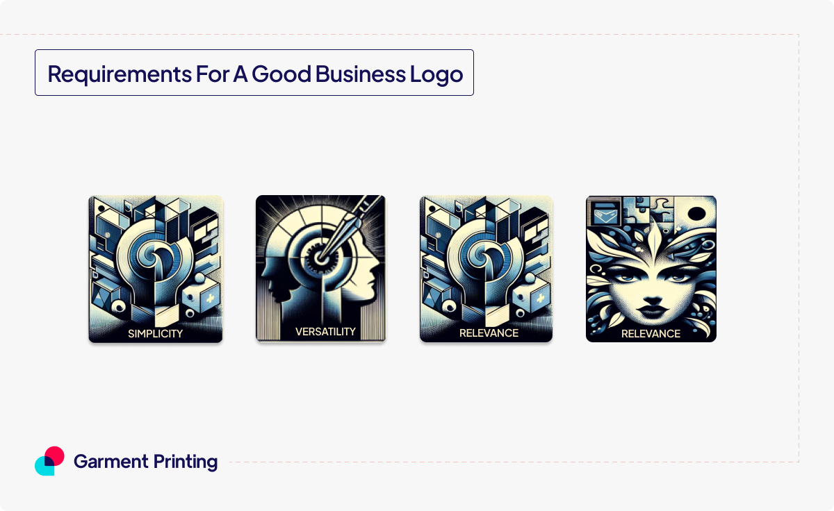
What are the 5 elements of a good logo?
The five elements of a good logo are simplicity, versatility, relevance, memorability, and timelessness.
What makes the best company logo?
The best company logos effectively capture the essence of the brand, are distinctive, memorable, and resonate with the target audience.
What are the requirements for a good business logo?
A good business logo should be simple, versatile, relevant to the brand, memorable, timeless, and scalable across various platforms.
What makes a company logo stand out?
Unique design elements, strong visual appeal, effective use of colour, typography, and symbolism, and consistency in branding can make a company logo stand out.
What are the 3 rules of good logo design?
The three rules are simplicity, memorability, and versatility.
What is the golden rule of logo design?
Golden Rule emphasises simplicity and clarity in logo design, advocating for designs that are easily recognizable and memorable.
How do I know if my logo is good?
You can gauge the quality of your logo by seeking feedback from target audience members and stakeholders and evaluating its adherence to design principles such as simplicity, relevance, and memorability.
What are the dos and don’ts of designing a logo?
Do prioritize simplicity, research your target audience, ensure scalability, and strive for originality. Don’t overcomplicate the design, rely too heavily on trends, use cliché symbols, or neglect scalability and versatility.
How do I make my logo look professional?
Focus on clean and clear design elements, choose appropriate colours, fonts, and imagery, ensure scalability and legibility, and seek professional assistance or utilize design tools to refine your logo.
Suggested Reads:
- Your Guide to Colour Separating for Custom T-Shirt Printing
- Modern Embroidery Designs Ideas For Workwear 2023
- Top Stylish Graphic Tees Every Man Should Own
Picture Credit: Freepik, ChatGPT